Most common anti-patterns for using web fonts

In the last couple of years web fonts became very popular. Almost every front-end developer has used web fonts in his projects. They are easy to use, embed, manipulate and they’re free (of course you can get premium fonts as well). Major web font providers like Google Fonts, Typekit, MyFonts and others completely changed the way we design and most of the time we end up using one of these. Some big names like Airbnb, Mint, Sony, IBM, Nike, etc., opted for web fonts and there are no signs that their usage will slow down in the near future. According to Builtwith, 64% of top 10k sites are using Google Fonts.
Web fonts cab be great when used correctly. However, there is a lot of confusion about web fonts. One of the main drawbacks is related to performance. Are they really slowing down your site? Maybe we shouldn’t use them at all? To clarify this, Bram Stein – a talented developer working at Adobe Typekit, listed some common anti-patterns that will guide you towards better web font usage. So, let’s have a look at them:
Overusing web fonts
Why are you using so much web fonts on a page? Because they’re great, right? We love them too, but don’t overuse them.
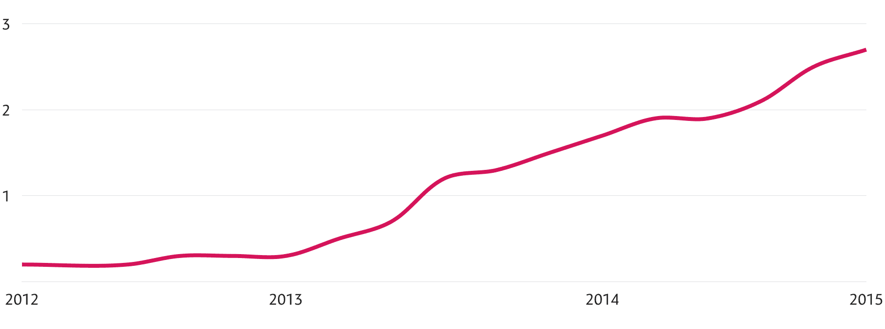
Recent statistics show that global average of font requests per page has tripled in the last 4 years (from almost 0 fonts in 2012 to roughly 3 fonts per page in 2015).
There is a trend to use more web fonts than is reasonable. This comes at a cost: it will increase you page load time and even worse, it can block your site from rendering until the fonts have loaded.
It’s fine to use web fonts for headlines and body text (ideally, you should only use 3-6 fonts per page). Try to not use more than that, and each time you add a new font think if it’s worth it and try to limit yourself to existing number of fonts.
Web fonts for lettering
Web fonts are not the right answer for everything. It’s not appropriate to use them for lettering. Use SVG instead, and you’ll avoid wrapping each letter or word in a span element in order to style them.

SVG is the best choice for lettering. It gives you absolute control over kerning, position, gradients, masking, color, etc. and the SVG file size will be smaller than loading several fonts. Also, you can get a lot of troubles if you’re using web fonts for lettering in a responsive design. You have to adjust the the position and size of each span at each breakpoint and soon this becomes boring. Again, SVG is the best solution here.
Finally, there could be a lot of issues related to localization. Think twice before using web fonts for lettering in diverse languages, this implies a lot of disadvantages (translation to other languages, special characters, compatibility, etc.).

Aggressive subsetting
Subsetting is a great way to reduce the file size of your fonts. You simply remove the characters and OpenType features that you don’t need (from a font file). In this way you’ll reduce the file size and make your font load faster.
Professionaly designed fonts usually contain characters for multiple languages, so you can use them all over the world. English doesn’t use many characters, so if you’re using it and have a font with additional characters, you can remove them and optimize your font. This can be done with different tools and services.
But, be careful, don’t overuse subsetting, you might have some unexpected consequences. For example, if the web font subset doesn’t contain characters used in your text, the characters from the next font in the stack will be retreated (most of the time these 2 don’t match). Have a look at this case:

Using local fonts
Never mix locally installed fonts and web fonts in @font-face rules. If you assume that 2 fonts are identical just because they have the same name, you’re probably wrong. In fact, the probability that a web font is the same as an installed font is very low.
The syntax is pretty straightforward: add one or more local font family names before the web font.
@font-face {

font-family: Neue Helvetica;

src: local('Helvetica Neue'),

local('Helvetica'),

url(helvetica.woff);

}
Apparently, this may look like a nice performance optimization. If the font is available locally the browser will not download the web font and will display the local font instead. But there is a problem here. Even though a local font matches the name of a web font, there is no guarantee it’s actually the same font. In fact, it most likely is not.
This can affect you site in many ways: the text might be rendered differently, OpenType features can be missing entirely, the line height may be different, etc.
Read more about the most common web font anti-patterns here and let us know if you would like to suggest more. The author will be updating the resource with new examples, so stay connected!
How widespread is the browser support for SVG fonts?