How the new iPhone 6 will affect the future of your website?

The iPhone 6 is officially out and in people’s hands! You know what that means: there are two new screen sizes and resolutions that your website needs to account for. Is your website responsive for iPhone 6? Will your website media be displayed correctly on these great new displays? As screen details change with new technologies, many site webmasters are asking about screen sizes and how they can ensure that their website will give users successful experiences, regardless of the device being used.
First of all, we have to understand the technical specifications of the new iPhone 6 and iPhone 6 plus. Here are some key points:
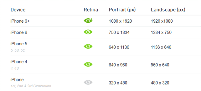
Screen size comparison

Resolutions and display specifications
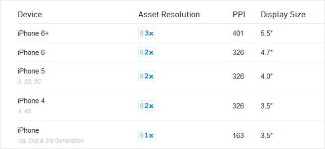
PPI (pixels per inch)
Pixels are the smallest physical element that we can control on a digital display. The more pixels can be fitted into a specific screen size, the higher the PPI (pixels per inch), and the clearer the rendered content becomes. Points are a resolution-independent measurement. Depending on the screens pixel density, a point can contain multiple pixels (e.g., 1 pt contains 2 x 2 pixels on a regular retina display).
Now let’s go through some of the most common questions that developers and designers might have:
What are the dimensions for the new iPhone 6 screens?
The 4.7 inch iPhone 6 has a physical resolution of 750px by 1334px, while the 5.5 inch iPhone 6 Plus has a physical resolution of 1080px by 1920px. Of course, like all high DPI mobile devices, the “reported” width or CSS width is much smaller. The CSS dimensions of the two new iPhones will be 375px by 667px and 414px by 736px, respectively.
How the iPhone 6 will impact the user experience of existing websites?
If your site is fully responsive/adaptive, you shouldn’t be worried about specifically accounting for the new iPhone’s screens. By design, responsive websites target particular screen sizes–not devices – so any new phone will correctly show your website as long as it is above the minimum width your site was developed for. Since the new iPhones (and mobile devices in general) are getting larger, it’s safe to say that if your website worked on the iPhone 4 or iPhone 5, it will work for the iPhone 6 and 6 Plus.
What about the images on a website?
The iPhone 6 Plus has a “reported” device pixel ratio of 3 (mathematically, it’s 2.4). This signals a preference for extra high resolution images 3 times the size they are displayed on the screen. Today, just a few phones are capable of putting those extra pixels to good use, but as always, you must balance the extra size with page load and performance goals. And of course all your vector (.svg) graphics will continue to look crisp on every resolution – this is still the preferred method of handling icons and simple graphics.
What about user agent sniffing?
You will need to update your configuration files to support the new user agent strings returned from the new iPhones. But if your mobile website still relies on browser sniffing, you’re probably due for a redesigned website anyways.
Further reading:
http://www.webdevelopmentgroup.com/2014/09/iphone-6-and-website-responsiveness/
http://iosdesign.ivomynttinen.com/
http://designmodo.com/iphone-6-watch-design/
http://mydevice.io/devices/