10 Smart Tips for Improving Your Web Design

When opening your website, can visitors figure out what your company does within 5 seconds? May users easily navigate your website, if they need? Is your pricing policy simple to understand? If you realize that the answer to these questions is “No”, it’s time to take an unbiased look at the way you design and optimize your web project.
In order to make a truly attractive website, it’s not enough to focus on one single aspect, for instance, content. You need a well-thought design that will ensure perfect website functionality and match the content. That guarantees exceptional user experience.
Your website should also clearly show the audience what you do, and who you do it for. You can praise your business as much as you want, but it will be useless unless you address the needs of your audience first and foremost.
What to start from when improving your website design? These 10 tips are essential for those strive to reach excellence and attract clients.
1. Planning First
Don’t just start making the design of your website. You need to make sure that it will meet the demands of your visitors and figure out visitor’s journey from the moment they visit your website to the moment they become real customers. Think which pages they will view, what they’ll read, and what offers will be converted on. Keeping in mind that you should design a website which turns leads into purchases.
Also don’t forget about the context when figuring out the design: use what you already know about your target audience, and research how visitors become real customers. Make this data work for your strategy. Take a look at statistics of your website: it may also provide some useful data about your end-users.
2. Declutter Your Website
Some extra elements on your website can detract users from the main information you want to convey: avoid using stock images, complicated animation and bulky content. It’s estimated that usually target audience has attention span of 8 seconds, so you need to make fast and positive first impression and convey your ideas. That can be done with short and concise sections of content and suitable photographs or icons. Don’t forget about eye catching headers, as well.
Avoid using jargon or complicated terminology, because it will only confuse your readers. Such words as “best-of-breed”, “mission-critical”, “easy to use”, etc. are not innovative anymore. They’re already used by hundreds websites around, so they won’t make your content look original. Hire a professional copywriter to write short but catchy sections of content for home and other pages of your website: that’s worth investing.
3. Use big fonts
Although big font isn’t innovative and original in website design, it is still relevant. It helps to get maximum reader’s attention and put focus on your content. Big typography would be perfect not only for smaller screens of smartphones and tablets (in such case, it’s a must for readability), but also for minimalism and flat design websites: it’s an ever-popular trend. Just don’t overdo: a few important highlighted words would be enough.
Web-designers recommend using minimum font size of 18 points. The text can be located in the header, images, or on a homepage. Just make sure that you apply a user-friendly interface that scales ideally instead of thinking which size to choose.
4. Leverage Share and Follow Buttons
It’s not enough just to create catchy content: give your readers the opportunity to post your articles. If your website doesn’t feature social share buttons, you can miss a huge mass of traffic generated by social media. Such icons don’t require much space (they can be located on the bottom, or the top of your blog posts), and this strategy is non-pushy. If you’re not a tech person, you can easily implement these buttons with the help of special plugins. Sharing is caring!
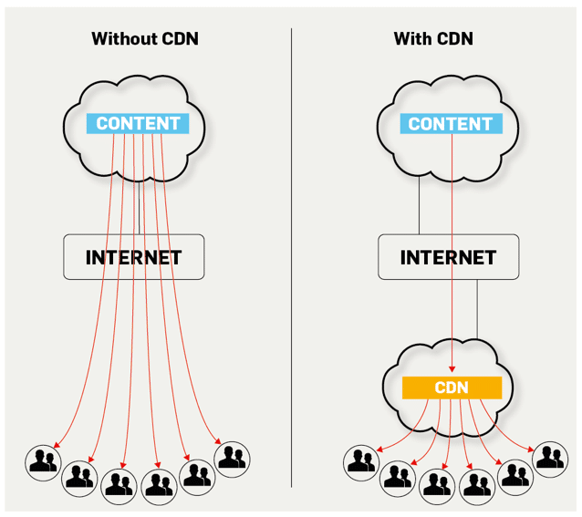
5. Implement CDN
You have an image-rich website, or produce heavy content (for instance, high-resolution videos)? Then an acceleration tool is a must for your project. A CDN (content delivery network) will cache all of your static content (images, JavaScript, fonts, etc.) on edge servers and transfer it faster to the end-users. The main idea behind this technology is to reduce the distance between the content source and the end-user: the fewer miles content goes, the faster it is delivered. CDN image hosting diminishes latency considerably and excludes the risk of content loss.
However, not all CDN solutions are equally suitable for your project. You will need to identify your target audience and order a network with PoPs (points of presence) placed in strategic locations. With such web-hosting solution you will definitely reach excellence!
6. Use the Right Images
Not all images are equally good for conveying the messages to your audience. Of course, there are hundreds of pretty pics in the Net, but don’t be tempted to plague your website with stocky photos. Just because your website has a stock image, it won’t look original and evoke trust to your company. Ideally, you need to use photos that contain images of real people who work in your company or the office. Hire a good photographer and order a few photos of your office, key employees, services, products or production processes and other business-related items and environments. Anyway, it’s always a good idea to keep those in your portfolio.
If using real photographs isn’t an option, you should select the techniques helping you to choose the right type of photo for your website. For instance, using infographics is always a great choice. It will make your project look more professional and show serious approach to what you do. Alternatively, you may hire a web designer to draw business-related pictures and icons (just make sure it conveys some message). The last but not the least is to make the content explaining: pictures should help you to open up the ideas mentioned in your texts, or provide additional information. It’s not enough just to publish a stock photograph of a smiling person – his or her activity should somehow be related to your sphere of competence or page content.
7. Ensure convenient navigation
Navigation is the key to making a user-friendly website. Pay particular attention to the map that shows main places your users can visit. There’s nothing worse than a website with poor organization, or incomprehensible interface, so your customers should be able to find what they’re looking for in a matter of a few seconds.
In order to make navigation simple you need to include:
- lean navigation bar;
- strict hierarchy;
- responsive design for mobile users.
Pay particular attention to the menu: include basic sections of website according to user’s needs, but don’t try to put there as much as possible. If you have a complex website, the best option is to make a pop-up menu with categories and sub-categories: that makes navigation a piece of cake. Remember: if visitor cannot find the desired information on your website, there’s no reason to stay there anymore. That will increase bounce rate and make them go to your competitors.
8. Let Users Scroll on Your Homepage
Don’t be afraid of making a slightly long homepage: include 3-5 sections that help users to discover your website better. Include the following crucial sections:
- Intro video.
- Your products and key features.
- About us.
- Feedbacks and testimonials.
- Success stories or case studies.
If you want to include more information, infographic will help you to convey many more ideas.
9. Mobile Optimization
Optimize your website for mobile users. Did you know that about 80% of users already visit websites via their smartphones? According to Google, about 60% of users are unlikely to return to a mobile website, if they have troubles accessing it, and 40% will go to competitors’ websites instead.
Tailor your website to the needs and wishes of a vast majority of your customers. Use a few different mobile devices to test your website and reveal its weak sides. If your project lags on mobile optimization, check out a few cool mobile-optimized websites to understand what they did to ensure great user experience.
In order to make the mobile version of your project perfect, you need to boost mobile loading and create a user-friendly interface. The first step can be done the following ways:
- Introduce AMP (Accelerated mobile pages) into your website. This is a free Google program that makes mobile pages load in a few milliseconds on mobile devices. Probably, you’ve already seen this before in Google search (headers have a lightning sign and AMP word by their side).
- CDN (content delivery network) can also come handy. However, you will need to find a solution tailored specifically to delivery mobile pages: there are not so many similar networks on the market.
- Install a plugin, or use codes helping to resize images automatically when being loaded on smartphones. This way, you can reduce their weight and make sure they look good on any device.
When you’re done with acceleration issues, think over the interface. If you have a CMS based website, the task is easy: install a responsive theme that will automatically reshape your pages according to users’ devices. Otherwise, you will need to create a separate mobile version of a website, which takes more effort and resources.
10. Attention to the content
Undoubtedly, content is the king of website: this is what expresses your ideas, explains your mission, describes your services and products, and pushes visitors to order them. Create content relevant to your users and experiment with its forms: implement e-books, videos, blog articles, and newsletters to catch attention and provide visitors with truly valuable info. Update the content, keep adding news and valuable articles, reviews and case studies, etc.
If you want to improve your mobile presence, create a website that can be easily found. Develop a SEO strategy that considers the items and keywords your audience would search for. Identify suitable keywords that your audience is searching for to make sure that you provide what will really attract people. Don’t strive to attract people who would never convert to your products.
Put a focus on “you” and “your’s” words instead of “we” and “our”. When you describe your company using sentences “We can boost conversions…”, “Our state-of-art facilities…”, you show how great your business is, but don’t explain to people how you can help them to solve their problems and which benefits they can reap. Your customers should understand the weak sides they have and what you can do about it. So instead of using headers like “Our Advantages” use something like “How You Can Reach Success”. Tell readers about their potential futures and describe what their future will be like working with your business. Although this grammatical change may seem minor, subconsciously it truly changes customer behavior.
As a business owner, you know that users are often attracted by demos, offers and other marketing stuff they find attractive. However, conversion process has become much more difficult to break through with so many different resources in the Net: competition is severe. It means that you should pay utmost attention not only to offers present in your service area but to resources that aren’t there too.
Maybe you’re an event organization agency that has noticed that other competitors show the list of their partners, or publish e-books on how to make a successful meeting? Instead of replicating their scenarios you can take a step further and come up with the idea of a tool that helps to generate events and synchronize them with schedules and calendars. Make an application, or create a proprietary program.
Although it may seem to be too complicated, you should try to brainstorm and identify the templates that aren’t currently widely used and quickly make the one and promote it. Whatever your ideas and decisions are, it’s crucial to ensure that you outperform your competitors. Copying other content offers won’t add credentials to your brand.
Poor design may surely dull a company’s competitive edge: your website is your business’ face. So think of every minutest aspect and detail of your design and follow these tips to reach the best results!
You may also like
5 Tips to Upgrade Your Web Designing Skills
‘Practice makes a man perfect’ is a good phrase to continue the pace of learning but what has become important these days is the skill to upgrade yourself with the […]
Read More
How Illustrations Are Used in Web Design
It is amazing how illustration is used across different platforms to express various designs and themes and at the same time pass a message. With the relevant innovation, illustration can […]
Read More