The ultimate guide for building truly responsive logos

In some cases, to have a fully responsive website, simply reducing the size of logo and other components for small resolutions, isn’t enough. For rectangular logos with a few details that’s fine, but for other cases you need another approach. That’s why, Jeremy Frank – a talented front-end developer from viget, explained how to build, adapt and work with responsive logos. Here are his tips and tricks:
1. Follow the style guides
Usually, a reputable brand has a a well designed logo and a comprehensive style guide. There you will find everything you need: logo variations (horizontal/vertical, short/tall, with/without marks), branding guidelines, specifications, etc.
Example: University of Pennsylvania
The small version of their logo has the logotype removed and the mark expanded (style guide here). This makes the logo clear and more legible on smaller resolutions.
See the Pen Responsive Logo – University of Pennsylvania by designhooks (@designhooks) on CodePen.
2. Reduce the level of detail
If you have a highly detailed logo you can always optimize it and reduce the level of details for small resolutions. Use this technique to a achieve a greater legibility of your logo on small sizes.
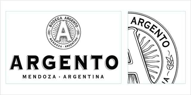
Example: Argento Wine
The Argento logo style guide has a nice illustration of various logos in different sizes. For each smaller size of their logo, the level of details is gradually reduced. Good job Argento!
See the Pen Responsive Logo – Argento Wine by designhooks (@designhooks) on CodePen.
3. Stacked & horizontal technique
This is probably one of the most used and simple techniques for adapting a logo for various sizes.
Example: Case-Mate
The mark is moved from above the logotype to the side and on the smallest size the “Case Mate” type disappears.
See the Pen Responsive Logo – Case Mate by designhooks (@designhooks) on CodePen.
4. Incremental subtraction
For logos with a lot of type, you can gradually remove it for smaller resolutions. In this way you will keep the legibility and brand recognition.
Example: NOAA
National Oceanic and Atmospheric Administration (NOAA) logo has a lot of text around its graphical emblem. For smaller sizes its subtracted and the brand recognition is maintained.
See the Pen Responsive Logo – NOAA by designhooks (@designhooks) on CodePen.
The bottom line
To have a fully responsive logo you have to implement flexible solutions. You can achieve that by following the advices of Jeremy Frank in his series of dedicated articles here (part 1) and here (part 2). Hope to see more in the near future!


This is Awesome, I work with responsive layouts but never think that we will make it easier for the clients and the layouts.
Thanks, hope if i get a job and I can share this in the company.