Top 25 typefaces admired by the leading typographers

Selecting the right typeface makes all the difference to effective design and communication. But with over 100,000 font families to pick from it can be a daunting task.
Wouldn’t it be great to start with a short list of typefaces, hand-picked by designers in the type industry? 8 Faces magazine asked eight leading designers from the fields of typography, lettering and type design itself: If you could use just eight typefaces, which would you choose?
Over four years they interviewed 64 world-renowned designers, including; Erik Spiekermann, Jessica Hische, Michael Bierut, Nina Stössinger, Mark Simonson & Seb Lester, plus owners of respected type foundries such as, Font Smith, Type Together and Process Type.
The top 10 designers’ favourite fonts will be quite familiar to many but hopefully the full list will provide a useful stepping stone to exploring many more. Here it is:
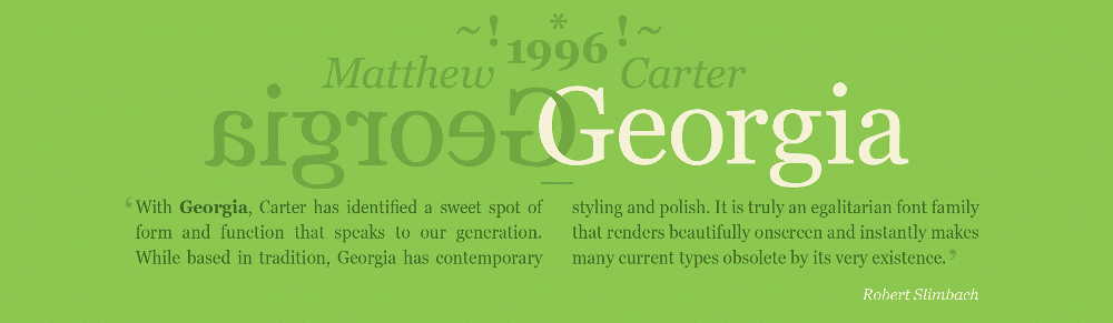
1. Georgia
Matthew Carter, 1993. Originally designed for clarity on low resolution screens, for Microsoft, it is the counterpart to Verdana, which also appears in this list. Georgia has a large x-height and ascenders that rise above the cap height. It’s a sturdy yet friendly typeface, with a wonderful flowing italic, that features on millions of websites.
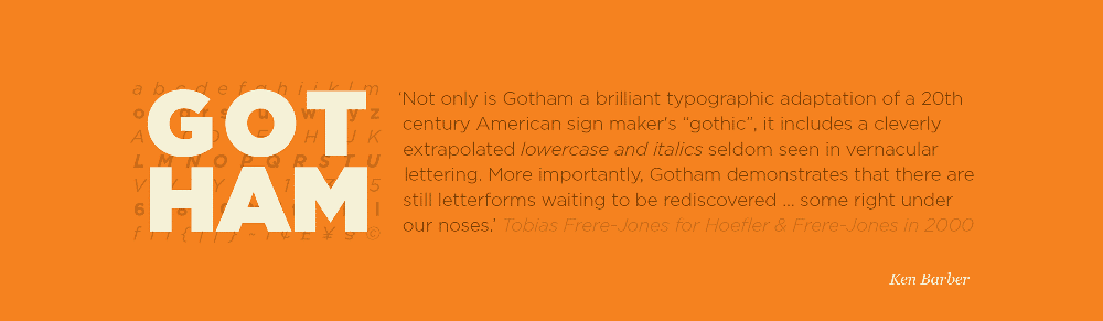
2. Gotham
Tobias Frere-Jones, 2000. Famously used for Barack Obama’s 2008 presidential campaign.
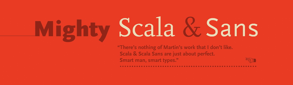
3. FF Scala
Martin Majoor, 1990. FontShop International’s ‘first serious text face’.
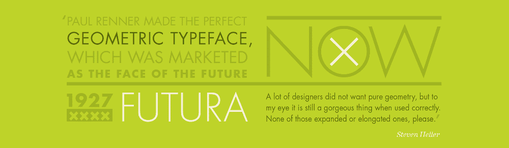
4. Futura
Paul Renner, 1927. This immortal ‘modern’ typeface with its uncompromising shapes has become the benchmark geometric sans for almost 80 years.
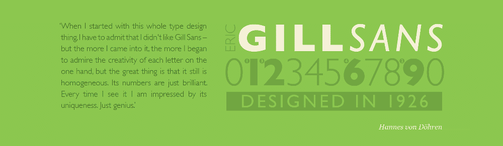
5. Gill Sans
Eric Gill, 1926. A quintessential British design; though it’s eccentricities make it notoriously tricky to use well. A blend of humanist and geometric shapes.
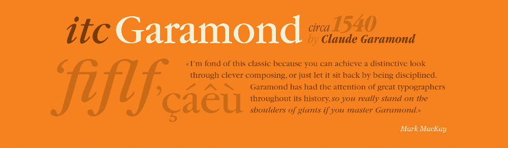
6. Garamond
(Claude Garamond, c. 1480–1561), Several derivatives of the Parisian punch cutter’s design have been chosen, including; ITC Garamond (Tony Stan), Adobe Garamond & Garamond Premier (Robert Slimbach).
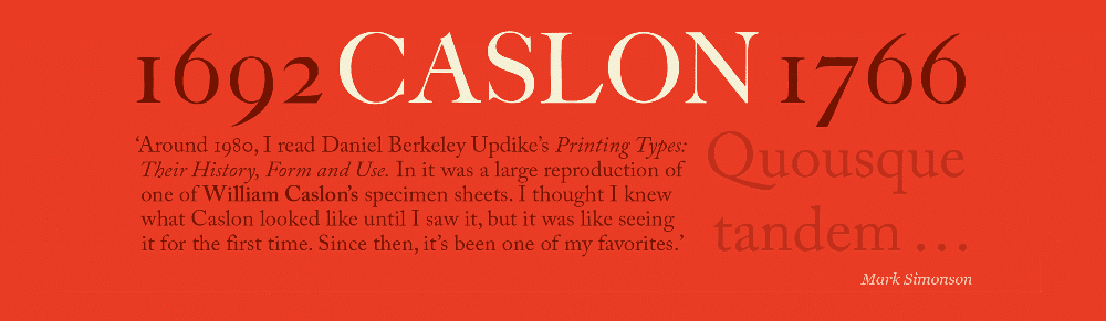
7. Caslon (Adobe Caslon)
(William Caslon I, 1722) Carol Twombly, 1990. Gave rise to a printer’s saying ‘When in doubt, use Caslon’. Also a favourite of Benjamin Franklin.
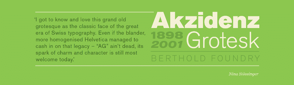
8. Akzidenz Grotesk
H. Berthold, Berthold Type Foundry, 1898. The first widely used sans serif typeface.
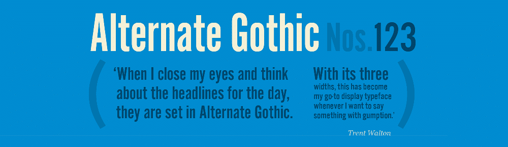
9. Alternate Gothic
Morris Fuller Benton, 1903. Designed for the American Typefounders Company (ATF). All three weights are bold and narrow. Currently used on YouTube’s homepage logo.
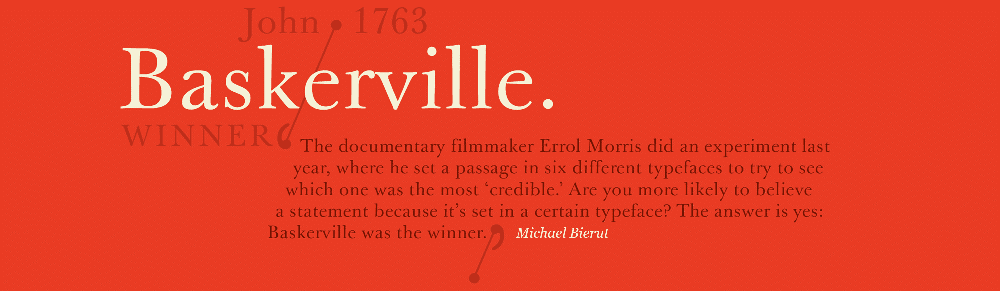
10. Barskerville
John Baskerville, 1757. Baskerville designed his own type to improve his printed works and better the dominant fonts of William Caslon. His typefaces were both admired (notably by Giambattista Bodoni and Benjamin Franklin) and criticised by his competitors.
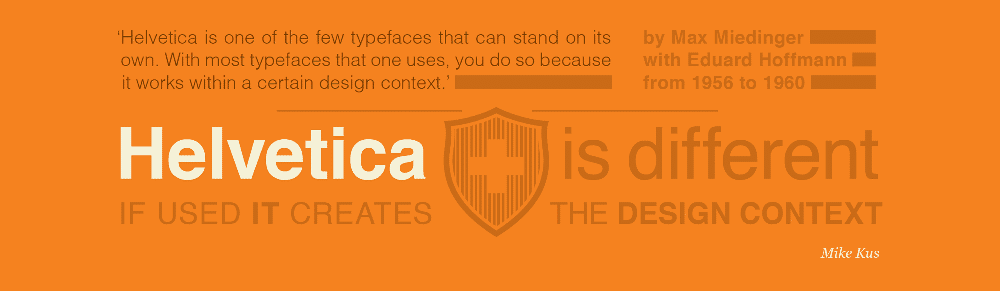
11. Helvetica
Max Miedinger with Eduard Hoffmann, 1957. Helvetica needs no introduction as the planet’s most famous typeface—it even inspired a very good film.
12. Metro
William Addison Dwiggins, 1930. Designed out of a dissatisfaction with the san serifs of the time like Futura.

See the full list of top 25 typefaces on 8faces blog.