Paradigm Shift – A Free Responsive HTML Template
 Fonts
Fonts HTML templates
 PSD Mockups
 Sketch
 WordPress themes
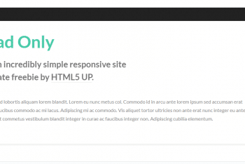
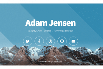
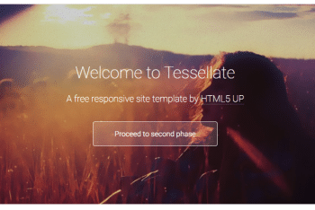
By making a website responsive you help it adapt to the size of your visitors’ viewports. The most important aim is for content to render in different ways depending on the devices or screen sizes so that individual visitor gets the optimal experience regardless of the way they access that website. The primary benefit of responsive web design is the site’s loading speed becomes faster than usual and in an uninterrupted way. Therefore users do not have to manually resize anything to view content. Are you planning to make your website responsive? Are you looking for a fully responsive HTML template for your website? Opt for Paradigm Shift, a stunning looking and responsive HTML template.
Being built on intelligent HTML5 + CSS3, this super customizable template is available here at absolutely free of cost. Using this template you just need to fill in the blanks with your web content and information. Within just a few hours your website will be ready. You will feel amazed to see how stunning it would look like and that too in a cost-effective manner.
Download this responsive HTML template for free now. Get the demo of how it would look in a desktop, a tablet and a mobile.