How to create a mobile preview tool with pure CSS

If you’re creating, selling or customizing different kinds of responsive templates for HTML, emails, WordPress, Ghost, Joomla, Drupal, Shopify or any other related platform: you have to present your demos in the most appealing way. Having a great preview tool for your responsive designs is the key to more customers and sales.
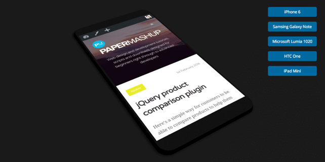
Ashley Ford – a talented designer and web developer, co-founder and technical director at Harkable.com, created a nice mobile preview tool to visualize responsive sites. It was created with pure CSS (JavaScript is used only to switch the mobile sizes).
He was inspired by a pen created by Felix Rilling which uses pure CSS to display a phone with an iframe embeded, allowing you to preview responsive sites. Ashley took the original code and modified it to make it easy to preview a site for different mobile screen sizes and added a rotational animation after the iframe loads.
Here is a demo with our site:
See the Pen Mobile UI preview tool by designhooks (@designhooks) on CodePen.
Have a look at this pen for a full-width preview.
Now, let’s get back to the code. Let’s see how we can achieve this result. Here is the CSS and HTML code of this great preview tool. Feel free to customize it and create other cool experiments or even tools:
The HTML
See the Pen Mobile UI preview tool by designhooks (@designhooks) on CodePen.
The CSS
See the Pen Mobile UI preview tool by designhooks (@designhooks) on CodePen.
The JavaScript
See the Pen Mobile UI preview tool by designhooks (@designhooks) on CodePen.
That’s it, if you want to download the zip archive with the code and preview the original demo please access this link. Cover image credit: papermashup.
Thanks for the code!, i update your code and added Orientation selection. Here the code: https://bitbucket.org/arucard17/page-preview-mobile
is there support for landscape?