How to design effective login forms with great UX
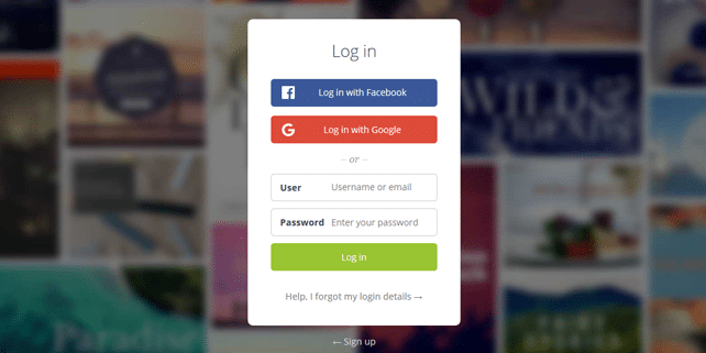
In our day to day online activity we’re going through login/register process multiple times. Sometimes this process is a pain (we hate when this happens) and provides poor experience and frustration. This is why, designers are in charge of creating appealing, logical and easy to use login forms that will provide a good UX. It seems like an easy job, but sometimes it’s simply ignored.
We’ve previously explored these kind of topics: how good or bad interface design affects user behavior, designing a better UX for the login page of GoSquared, 10 UX design trends to follow in 2016 and found out that it’s really important to provide the best UX to your users.
Inspired by the original post by Nick Babich we’ve comprised a list of most common login form design mistakes. We went further, and inspected the sign in/sign up forms of some of the most popular web tools (let’s see if they care about them). So, here are some handy tips for designing better login forms:
1. Show login/register input fields
If getting more users is your primary focus, don’t hide your login forms (by using buttons or drop downs, etc.) and try to always show input text fields. In this way your registered users will clearly see where to login (without extra steps or difficulties).
2. Avoid using “Sign in” and “Sign Up” together
These 2 labels look too similar and can provide a lot of confusion. Avoid using them together and use Login/Register labels instead + use different visual appearance. However, if you decide to use Sign In/Sign Up together, try to make the difference more evident. Here are 3 examples: poor, good and perfect:
3. Differentiate login and register forms
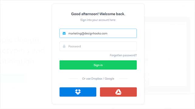
This is probably a common frustration and it happens quite often: when you try to login and it turns our that you’re trying to register. This happens because there is not a clear differentiation between these 2 forms. You can achieve that by using different text labels, colors, buttons, separators, position, etc.
4. Allow users to login with social media accounts
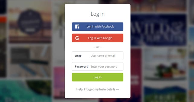
Logging in with Facebook, Twitter, G+, etc. is easy and fast. You don’t have to fill in your info each time and remember your password/username. Still, this process can rise some privacy concerns, so watch carefully what info do you share (as a user).
5. Provide the “show password” option
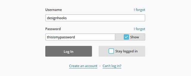
Mistyping a password is quite a common problem. The password fields are always masked and this is necessary for security. But you can ease the life of your users by implementing the “show password” feature. It’s not so hard to do and is very useful for users with mobile devices.
6. Use multiple options for login (phone, email, etc.)
A username is one of the most popular options for login, but you can easily forget it or select a proper/unique one. Providing multiple options for login (phone, email, username) would simplify the process and provide a better UX.
7. Keep your users signed in by default
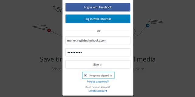
Instead of providing a “stay signed in option”, keep your users signed in immediately after registration. This will make the overall UX much smoother.
8. Notify users when caps lock is on
This is a handy option which will warn your users to not include unintended characters. You can use a warning text notification or a dedicated icon.
9. Auto-focus the input fields
This small options gives the users a sense of orientation and saves their time. Once they see the auto-focused 1st field they should be ready to login.
These useful tips should make your forms more effective and increase the overall UX for your users. Keep them in mind and let us know if you know more.
Cover image: credit. Thanks for providing us login/register forms for testing: proto.io, marvelapp, invisionapp, themefuse, buffer, mailchimp and thanks for the idea Nick Babich.


“Sing in”?
“These 2 labels look too similar and can’t provide a lot of confusion”
What?, and Can’t they?
Hi Freddy, sorry for the typos (fixed that), we were in a hurry. So, don’t use sign in/sign up together, they really can provide a lot of confusion. Thanks!
You stole this article from UX Planet (almost identical content, exactly the same sections, and order plus it was written 8 days earlier). Terrible behavior.
Darren,
How about reading the article first before coming up with a crap like this? We even linked to your mentioned article but to the original, not the Medium article which is a republished article itself.