How to create different shapes using the clip-path CSS property

Are you familiar with clipping? It’s a widely used technique that defines a certain region of an element that is visible. Everything around this visible region is clipped and doesn’t get rendered. In simple words: you hide some visual portions of an element and show a certain region that you want.
A little bit about clip-path property
The idea behind clip-path isn’t new, CSS2 already specified the clip property. But it’s limited to rectangular clipping and is working only with absolutely positioned elements. The clip property has some limitations in SVG as well. That’s why clip-path property was added to SVG specifications.
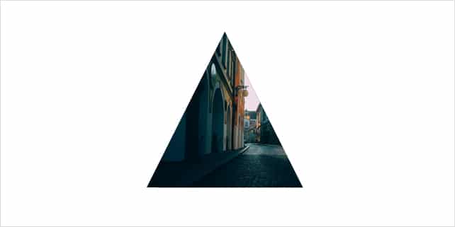
The clip-path can be applied to all HTML and SVG elements. The way it works is quite simple: it provides a series of X and Y values to create a path. These values clip the image and show only the defined area of your element. With this property you can create lot’s of different shapes: from simple triangles or circles to more complex geometric shapes. Your imaginations is the only limit. Here is a simple example:
See the Pen Showing the use of clip-path by designhooks (@designhooks) on CodePen.
To achieve this triangle effect you have to take one element and apply a clip path-to it.
.clipClass {

  -webkit-clip-path: polygon(0 100%, 50% 0, 100% 100%);

}
Clip-path support
Clip-path is a part of working draft and is not widely supported by all major browsers. Only webkit based browsers (Chrome, Safari, Opera, etc.) are fully supporting it. In any case, you can create awesome effects for these browsers (waiting for Firefox and IE). Here is the compatibility list.
Back to our main story
Drew Minns, a talented UI/UX designer, developer and teacher at drewminns.com got an interesting request from one of his students. He wanted to replicate an effect seen on Squarespace website. Drew decided to help his student and dived into this interesting journey, where he explained how to work with clip-path CSS property and create different cool shapes with it. Let’s see some examples.
Creating shapes
Circles
See the Pen LVpErv by designhooks (@designhooks) on CodePen.
Comic textbox
See the Pen aOvzjQ by designhooks (@designhooks) on CodePen.
Star
See the Pen VLvYBo by designhooks (@designhooks) on CodePen.
Animation
You can use diverse shapes to create stylish effects. Here is one of them:
See the Pen OVyPoX by designhooks (@designhooks) on CodePen.
The bottom line
Although clip-path is not yet supported by all major browsers, you can use it to create really nice effects and animations. You can also combine diverse shapes and create more complex ones, your creativity is the only limit!
Further reading
http://www.html5rocks.com/en/tutorials/masking/adobe/
http://caniuse.com/#search=clip-path
https://medium.com/@drewisthe/using-making-sense-of-clip-path-cf651676438c
Note: You can also use background-clip: text to clip your background according to different characters (letters, digits, even font icons). This is a handy property that you can use in some cases (for example when you create banners or hero units).
https://css-tricks.com/image-under-text/
http://codepen.io/Jintos/pen/crlxk
http://caniuse.com/#search=background-clip