Matt created a font family in 3 years, and the result is awesome

Today we’ll talk about a unique project and an inspiring story. Its author is Matt Vergotis from Australia. He is the founder of Verg agency and a passionate designer in love with typography, lettering, logo design, corporate identity and much more. He has a simple philosophy in life: do the things you love to do.
I believe a client should fall in-love with their identity and not just accept mediocre attempts.
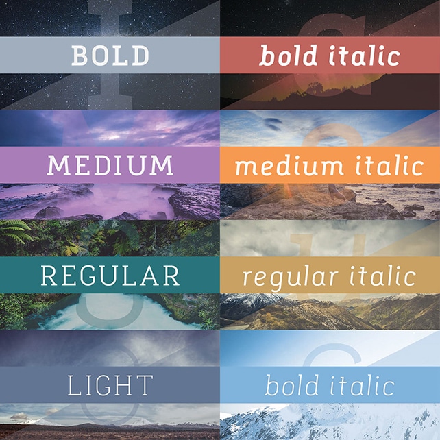
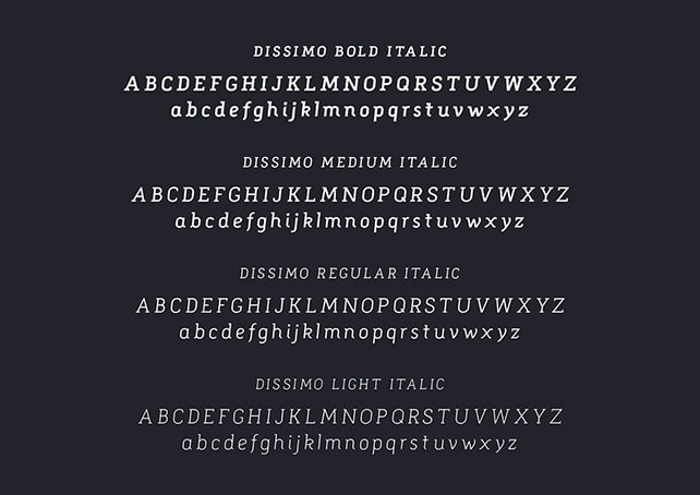
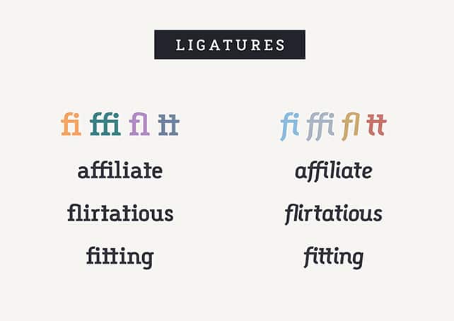
Following his aim to provide great works, Matt created a font family in his spare time. It took him 3 years of hard work, passion and patience to craft Dissimo: a beautiful, rounded and clean font family. Dissimo includes 8 sexy fonts, a lot of glyphs and is suited for all kind of creative professionals from all over the world.


We got in touch with Matt and asked him to tell us the story behind this awesome project. He was happy to answer a few questions and reveal the experience he had designing Dissimo font family. Here are his answers:
1. Tell us a few words about yourself?
I’m from the Gold Coast, Australia which is a coastal city an hour south of Brisbane. I’ve been self employed for 8 years now operating as Verg where I specialise in Corporate Identity, although over the last few years it’s been my lettering and brush pen calligraphy that’s been at the forefront of my work. Outside of work I have a young family and I surf every morning.
2. Why do you love typography & lettering?
So much personality can be infused into a letter or word by your stylistic approach to designing it. The ability to be able to tap into that is a form of expression that I enjoy. There’s also an element of obsessiveness required to refine and execute your letters and curves to strike an aesthetic that I find very rewarding. When you start to perfect that form and end up with something curvaceous and beautiful it feels good.
3. What is the story behind Dissimo font family? What is its origin?
Dissimo’s origins began as a logotype for a fashion label called Museology. Museology being the study of Museums inspired me to design letters that felt like solid and sturdy columns that grace the entrance of a grand museum. Once I created this logotype I thought to myself ‘I need to take this further’. Because I design most of the typefaces for my logotypes I often get that urge to develop them into fonts. But that’s a huge undertaking as any font creator would know – so for me it’s something I have to do in my spare time or during quiet periods at work. Dissimo is only the second time I’ve created a font. My first time was with a font called Knubi and it was just one weight, so for this time around I wanted to make a font family so it was versatile and more marketable.
4. Creating a font family in 3 years (in your spare time) seems like a tremendous amount of work and patience. How did you succeed?
Yeah, you’re not wrong. It is an incredible amount of work and I guess you just have to tackle it in bite sizes. Looking at the big picture is too overwhelming as there are just so many things that need doing. I’m pretty good at focusing on little details and chipping away at it. By compartmentalising it and by tackling small chunks at a time, it’s amazing how much work you can get through. My problem was that client work would get in the way and whenever I did have a small opportunity to work on it, I’d pick up the brush pens instead. So what I did to finish the font was set myself a deadline. I decided 2015 would be the year I’d finish it up, get it done, smash it out of the park. I finished it on the 30th of December. 1 day to spare!
5. What keeps you motivated in your day to day work?
I love creating, I love pushing myself to explore and execute different styles. In my field of work it’s important to be adaptable to many different client requests, so that gives me the opportunity to try new things all the time. I guess having to provide for my family is a pretty good motivator too.
6. What are your sources of inspiration?
Because I follow a lot of designers on social media and I’m fairly active promoting my work to these sites such as Instagram, Behance and Dribbble, my feeds are always full of beautiful typography.
7. Anything else to add or thank someone?
I can’t wait to build my next font. I learned a great deal from Dissimo and my knowledge of typeface design grew during that 3 years. So I can’t wait to apply it to my next font, which will more than likely be a font family again but this time a san serif typeface.
To celebrate the launch of Dissimo, Matt is giving away the Medium weight for free. Feel free to visit his site and get a copy of this wonderful font.
Awesome font.. great work Matt. Keep it up..