Case study: designing a better UX for the login page of GoSquared

A secure website with great usability is a sign of a professional product. Combining these 2 (security & usability) is not an easy task, but it seems like the guys from GoSquared found the perfect balance between them.
What did they do? First of all they implemented a two-factor authentication to make the accounts of their users more secure. Then, they redesigned the login page and improved the user experience for the whole process.
They wanted to create an elegant, intuitive and fast signin process for they users and in the same time to provide a completely secure environment. They actually succeeded and revealed the whole process in an interesting article.
Along their journey they discovered a lot of interesting stuff and comprised a set of nice tips and tricks:
The login process should be effortless
You go to a login page because you want to login to your account and not to experience the page itself. That’s why this process should be as seamless and easy as possible. Two factor authentication complicates the process (more actions and steps, confirmations, etc.). Make sure the flow if correct and effortless.

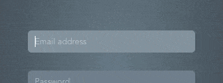
Play nice with placeholders and labels
If you want to use placeholders as labels (which actually look nice), you have to play nicely with accessibility and autofill. If you’re using placeholder attribute on HTML inputs, the users will never see the placeholder (when they input something in a field or use an autofill feature). Consequently, the guys from GoSquared came up with a pretty neat solution:

And on mobile devices it looks like this:
However, this great feature generated some additional challenges (that were identified and solved).
The login process should be fluid
Instead of redirecting users to a new page for every step of the login flow, they provided a super simple and beautiful solution. Users stay on the same page and experience a smooth transition:

Provide a login button
It turns out that users like to click a submit button after they fill in the login form. Provide a proper login button for your users (that is beautiful and easy to tap on mobile devices).
It could be slow, but everything is good
When you click the signin button on GoSquared login page, it might take a few seconds before you get into your account. That’s because of security (checking passwords requires a large amount of computations) and even if they optimized everything, the users might wait a little. They needed to show a visual feedback that would say “you’ve submitted this form, everything’s good, just hang on a moment”. Including a spinner animation was the best way to do it.

James Taylor, one of the founders of GoSquared and a talented front-end developer was happy to answers a few questions about this project. Thanks James for taking the time and sharing your experience with our readers! Here are the answers:
Why you decided to improve the UX of login page?
We’ve been changing a lot of things recently here at GoSquared. Our latest product, People Analytics, means we’re storing a lot of sensitive data in our systems, and that led us to spend some time reviewing account security. One of the main things to come out of that was the necessity for two-factor authentication (using a unique code sent to you by SMS or generated by an app as well as your password for login), which we launched earlier this month.
Ever since we last reworked our login process we’ve received a load of useful feedback, and had ideas of our own, of how things could be done slightly better, but we’ve simply not had the time for it. Since we knew that adding in two-factor authentication was going to require a fairly large overhaul of the code powering the whole process, we decided to take the opportunity to address all of those outstanding issues, give the whole process a good spruce-up, and make it the best we possibly could.
How many people were involved and how much time it took?
For the whole process, there were three of us. Myself (front-end developer, I wrote all the actual code), James (the designer), and Simon (who implemented the backend for our two-factor auth system).
The building of the login screen itself took maybe two days of development time, and then a further couple of days testing, fixing up bugs we found in our 2fa system, checking we hadn’t left any gaping security holes etc. It’s actually surprising how complicated something so seemingly simple can be – there are so many different states to think about depending on whether you’ve got two-factor authentication, whether you have backup codes, whether you’re resetting your password, how to deal with incorrect email addresses or passwords… In the end there’s no substitute for just manually running through every possible scenario and checking that it all works. We discovered quite a few things we’d forgotten in the process.
Tell us a little bit about your workflow, what tools are you using?
I should clarify that I am primarily a developer, not a designer (I leave that to much better people than me). I spend most of my day with my head buried in code. I’m a big fan of GitHub’s Atom editor and do almost all of my work in it. Usually we put together initial designs and prototypes for a project using Sketch, and then build and iterate in the browser – we find it’s very useful to get a feel of exactly how an experience works once you can actually interact with it. We’re avid users of Slack for team communication, which allows us to discuss and iterate on ideas without physically standing behind one another. BrowserStack is great for cross-browser testing and making sure we haven’t broken everything in IE, for example.
Did this particular project somehow change the behavior of users?
It’s hard to tell – at the end of the day the login screen for an app isn’t something that most people are going to see all that often, and they certainly aren’t going to spend a huge amount of time on it. And people aren’t going to just stop using your app if the login process is slightly clunky or slow or whatever. What we’ve tried to achieve with this update is for everyone who does see the login screen, the whole process should feel completely effortless – you shouldn’t have to think about the process at all, you just want to get into your account quickly and start doing stuff that’s actually useful.
The introduction of two-factor authentication has certainly been received well by our users. A lot of people who use GoSquared are concerned about the security of their account and their data and we’ve seen quite a few accounts activating two-factor auth since we released it a couple of weeks ago.
How is your usual working day, what keeps you focused and productive?
Most of my day is spent coding – first and foremost I’m a developer. I’m also one of the founders of GoSquared, which means I get a fair share of admin and paperwork and other such exciting things. For maintaining focus, we at GoSquared try to use Slack for all our team communication. That means we have very little distraction in the office – there’s very little out-loud conversation or tapping someone on the shoulder to ask them a question. For productivity and general project management we use Sprint.ly, and use that to ensure everybody on the team knows what’s currently going on, what’s up next, and what they’re currently supposed to be working on.
Further reading:
Building two-factor authentication
5 steps to making a Node.js frontend app 10x faster
Optimising for 60fps everywhere
Are you constantly improving the UX for your projects? We would be happy to find out how are you doing this. Don’t hesitate to comment or get in touch with us!