How good or bad interface design affects user behavior

A clear, logic, fast and easy interface provides a great user experience. It’s the UX designer’s job to make this happen. The guys from UX Movement are listing examples of good and bad interface design and explain how they affect the user behavior. Let’s have a look at some of them.
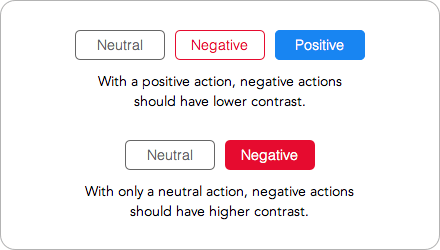
How button contrast influences users actions
Buttons with positive actions (change, save, send, add, etc.) should have a higher contrast. Neutral or negative actions (cancel, delete, reset, etc.) should have lower color contrast.

Exception: A higher contrast can be used for negative actions, only if they are placed next to neutral actions.
Why you should remove orphans from your paragraphs
Orphans are short lines that appear at the end of a paragraph. You should remove them from your body text because they affect the readability and aesthetics of a web page.

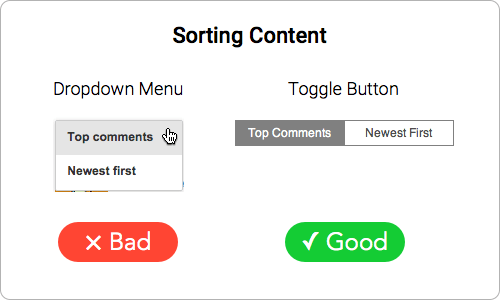
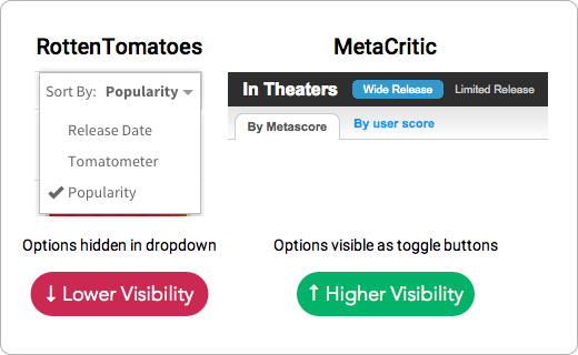
When to use toggle buttons
Many designers make the mistake of putting their sorting items in a dropdown menu. Users only see the selected option, while the other sorting options are hidden.
How hamburger menu can increase the conversion rate
The explanation for this is quite simple: less navigation means fewer distractions when users sign up. Minimizing your navigation focuses the user’s attention on completing the form.

Do you know more examples of good or bad UI/UX? Please share them with us!