New design concept for SoundCloud

SoundCloud is one of the leading online audio platforms for music listeners and producers. It serves over 175 million monthly listeners. Clearly they’re doing a lot of things right. Still, their platform plays an important role in music discovery, and distribution and its design matters.
Evan Simoni – a professional designer and developer, and an avid user of SoundClound, came up with some ideas and concepts about its design and usability. He listed some of the most common UI/UX problems of SoundCloud and suggested his own solutions. Here are some of them:
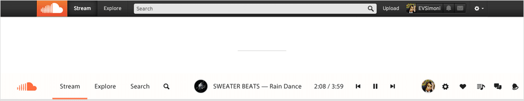
1. The navigation bar & player widget
The width of the search bar’s input field is reduced to 108 pixels, freeing up space for the player widget, which has been added in the middle.
Important links are right on the navigation bar instead of nested in a dropdown. The profile picture navigates to the user’s profile and the icons on the right link to their settings, likes, playlists, messages and notifications. The upload link has been removed since it doesn’t need to be accessed at all times. It belongs on the profile page.
2. The stream
The active song is clearly indicated by its expanded size, large artwork and visible waveform. Additionally, more songs can be displayed in the same amount of space.
There is an option to have the Stream automatically scroll as it plays through. Enabling this feature moves a track to the top of the page when it begins playing, as shown above with the Goldroom song.
The buttons to download, like, repost, comment, add-to-playlist and share are replaced by icons. The icons alone sufficiently convey their function and they don’t need to be translated to multiple languages. To keep the interface neat, the icons are only visible in the hover state (but the current song always has them displayed).

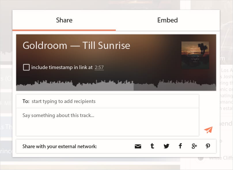
3. Sharing
This two-tab design promotes messaging first, without removing access to external network sharing. Integrating both options in the same view will help bring in new users and keep regulars coming back.
4. Messaging
When the messaging icon is clicked in the navigation bar, the messages view slides out from the right side of the page, similar to the notifications panel in OS X Yosemite.

Read the whole story about SoundClound redesign on medium.