Top 8 web tools to test the responsive design of your site

Responsive design is a must these days. If you don’t provide a seamless web browsing experience across all devices, you’re probably loosing your customers or readers. According to Skillcrush, 40% of users will choose a different search result if the desired one is not mobile friendly. Google treats the mobile friendliness as a ranking factor for organic search results, this means that if you have a responsive site you’ll probably rank better in mobile search results. There are so many advantages for using responsive web design that you can’t simply ignore it.
In 2010, Ethan Marcotte defined “responsive web design” in his famous article and since then it simply exploded, and changed the way designers and developers create websites. Responsive web design (or simply RWD) became the new standard for building awesome sites and provide a really unique experience for users with different screen sizes.
Currently, there are multiple tools, extensions and utilities to test the responsive design of your site. The easiest way is to hit the F12 key (or related shortcuts) in your preferred web browser and open the Inspect functionality (DevTools in Chrome). From there, simply enable the responsive design mode (Emulation panel in Chrome) and preview your site using different screen sizes, devices, touch events, etc.
If you prefer interactive web viewers, where you can include your URL and get an instant preview of your site for different resolutions, there are plenty of tools on the market. We have selected 8 best web tools to test the responsive design of your site. Here they are:
1. Resizer
A brand new web preview tool recently introduced by Google. It allows you to preview your site in different resolutions and test it across different Material Design breakpoints (you can read more about responsive design breakpoints and how to define them here, here and here). Resizer also includes some examples of mobile apps, where you can see how the layout and FAB (floating action button) are changing according to diverse resolutions. Nothing new under the sun, it’s a simple and clean tool created by Google.
2. Responsive web design test tool
It’s a clean and modern web testing tool created by Designmodo. Here you can include your URL and preview your site in different resolutions or choose from a wide variety of desktop or mobile devices (iMac, MacBook, iPad, Galaxy Tab, iPhone, Galaxy S, etc.). You can also include a custom resolution and rotate your canvas (landscape, portrait view). There is also a nice pixel grid which fades our when you’re in the preview area.

3. Responsive design testing across devices
This tool created by BrowserStack is generating screenshots of your site and shows them in realistic devices. There is a wide range of popular devices which you can rotate (portrait, landscape view), see additional info and easily navigate to next device using your keyboard. However, to test your site you have to signup and login to their site.

4. Responsive.is
Responsive.is is a simple and clean web interface created by Typecast (you’ll see their site included by default). Here you can preview your site on desktop, tablet and mobile (portrait and landscape view). It’s very similar to demo preview tools offered by a lot of WordPress theme shops (which is basically an iframe with a demo inside).

5. Responsive design checker
This is a simple and interactive tool created by Media Genesis. You simply insert your URL and preview your layout on a predefined number of devices (categorized by: desktops & laptops and tablets & phones).

6. ResponsiveTest
Another great tool to test the responsiveness of your site. It was created by Phuoc Nguyen who used jQuery, Bootstrap 3 and AngularJS to to build this tool. It works as usual: insert your URL and preview its design in different screen sizes and devices. You can define a custom resolution and rotate your canvas (portrait, landscape view). A pixel ruler is also available.

7. Screenfly
This is also a cool responsive design testing tool created by QuirkTools. It includes plenty of devices (most common laptops and desktops, iPad, Galaxy tab, Kindle, iPhone, Galaxy S, etc.) and features (custom resolution, rotation, scrolling lock, sharing option, etc.). A pixel ruler is also available.

8. Mobile responsive design testing
A simple interface to test your design across standard responsive design breakpoints (240, 320, 480, 768 and 1024 px). It was created by Studiopress (based on the original tool created by Matt Kersley and published on Github).

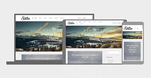
If you know another awesome web tools to test the responsive design of a site, let us know. P.S. Our latest free blog WordPress theme Sentio has a fully responsive layout, go ahead and test it here.