Unique stories revealed in beautiful data visualizations

Data visualization and information design is more than storytelling. It’s a collection of data, design, function and form, all put together in a beautiful, elegant way. There are great stories hidden in your data, you only have to represent them in the appropriate manner.
IIB Studio (Information is Beautiful Studio) – a design agency from London with over 40 years of experience, is the champion of this job. The team behind IIB Studio is transforming the data into stunning infographics, interactive designs, motion graphics and other visual representations.
Just to show you the power of an awesome design, we listed some examples of interesting data visualizations created by IIB Studio. The designs were made for big names like BBC, Google, Visa, Audi, Panasonic, etc. So, here they are:
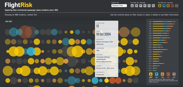
Flight risk – interactive visualization (BBC Future)
Exploring fatal commercial passenger plane incidents since 1993. In this visualization users can filter results to spot patterns and find out the stories behind the numbers.
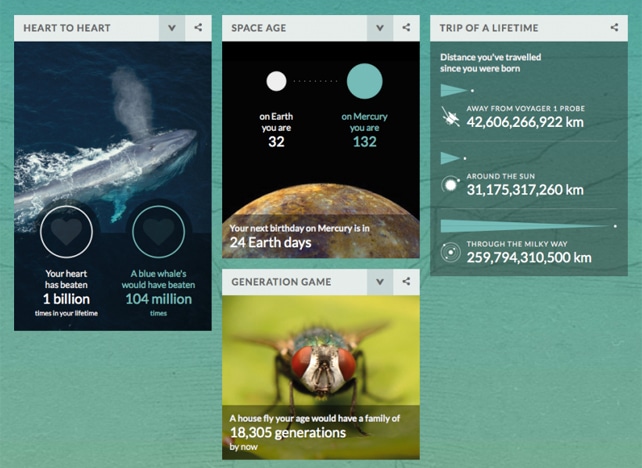
Your life on Earth – interactive visualization (BBC Earth)
Start discovering your life on Earth with this interactive visualization. How you and the world have changed since you were born.
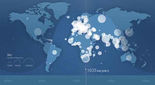
A day in the life – motion graphic (Visa)
A dynamic visualization of 24 hours in the global life of Visa. Cross-border transactions and domestic spending habits from countries and cities around the world.
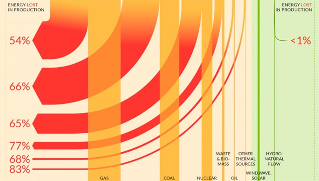
Up in smoke – infographic (Friends of the Earth)
Where UK electricity comes from, how much is produced, how much lost, and finally how much reaches UK homes.
For more awesome visualizations visit the IIB Studio’s portfolio.